Visual identity system for Quince.
Research
The foundations of Quince began with the study of Mexican and Spanish cultural aesthetics. Mexican visual traditions emphasize bold geometric patterns and vibrant colors that express energy and heritage. In comparison, Spanish design often embodies symmetry, refinement, and elegance. I aimed to create a visual identity that combines both influences, resulting in a brand that feels culturally rooted, yet modern and sophisticated.
Brainstorm
I explored multiple directions for the logo. I started by deconstructing the natural forms of both lowercase and uppercase letterforms, searching for opportunities to reveal a hidden meaning within the typography. I also explored iconography into the logotype to substitute letters. This process guided me toward a solution that began to shape the foundation of the brand’s visual identity.
Design & Refinement
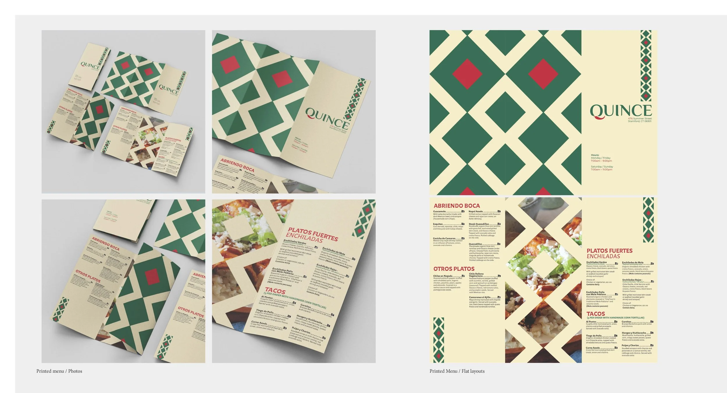
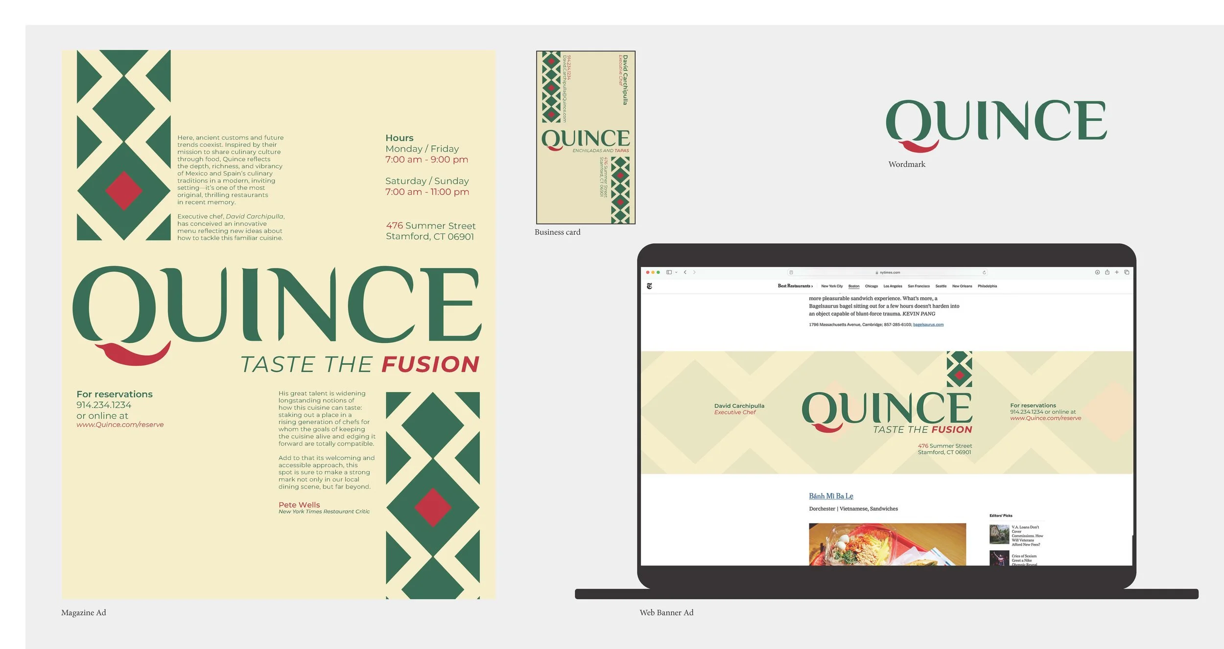
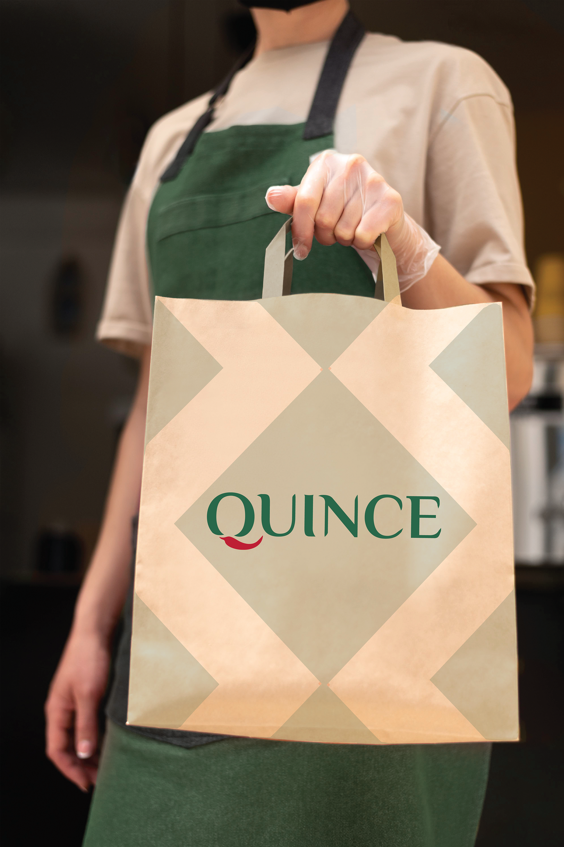
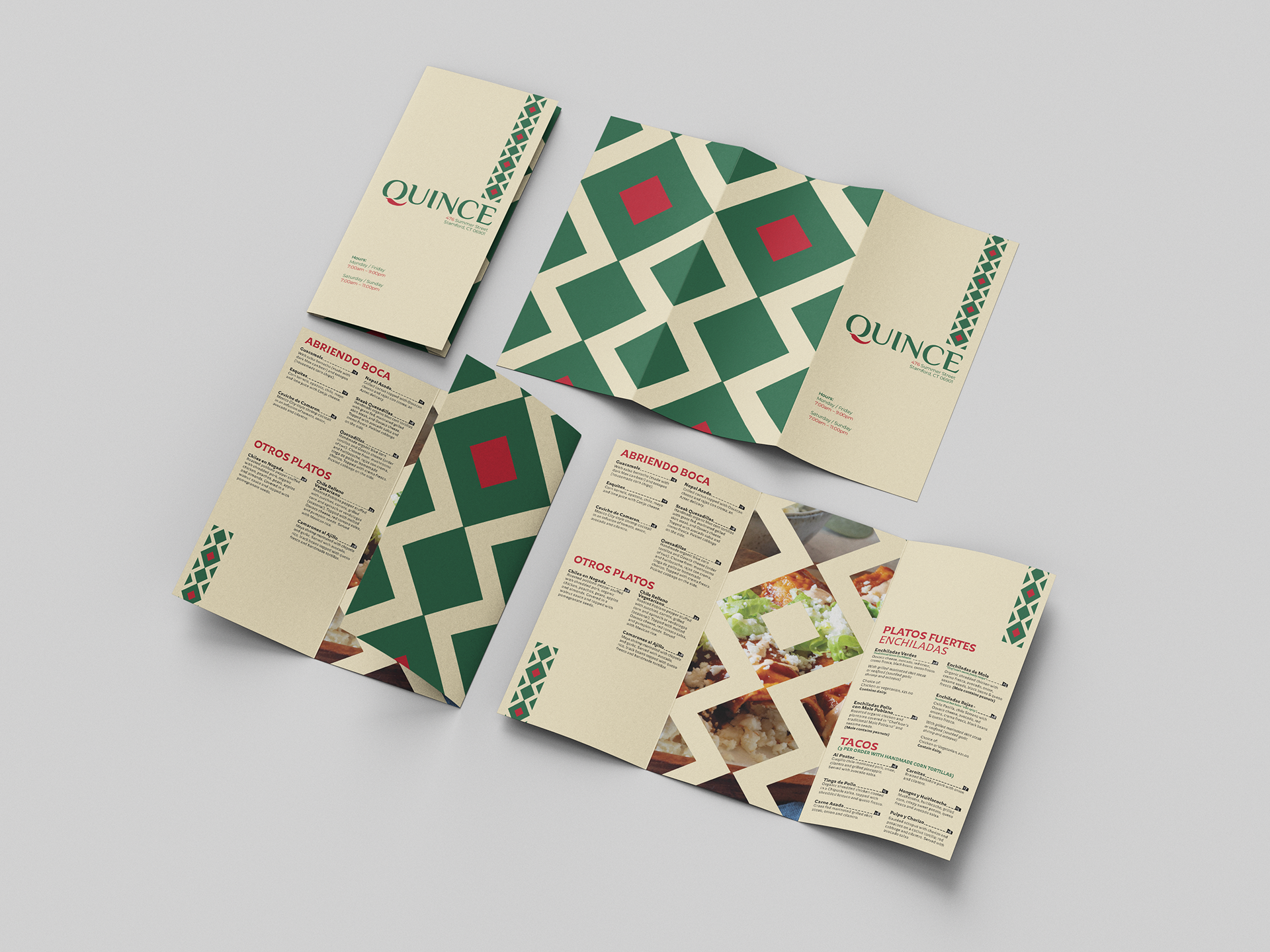
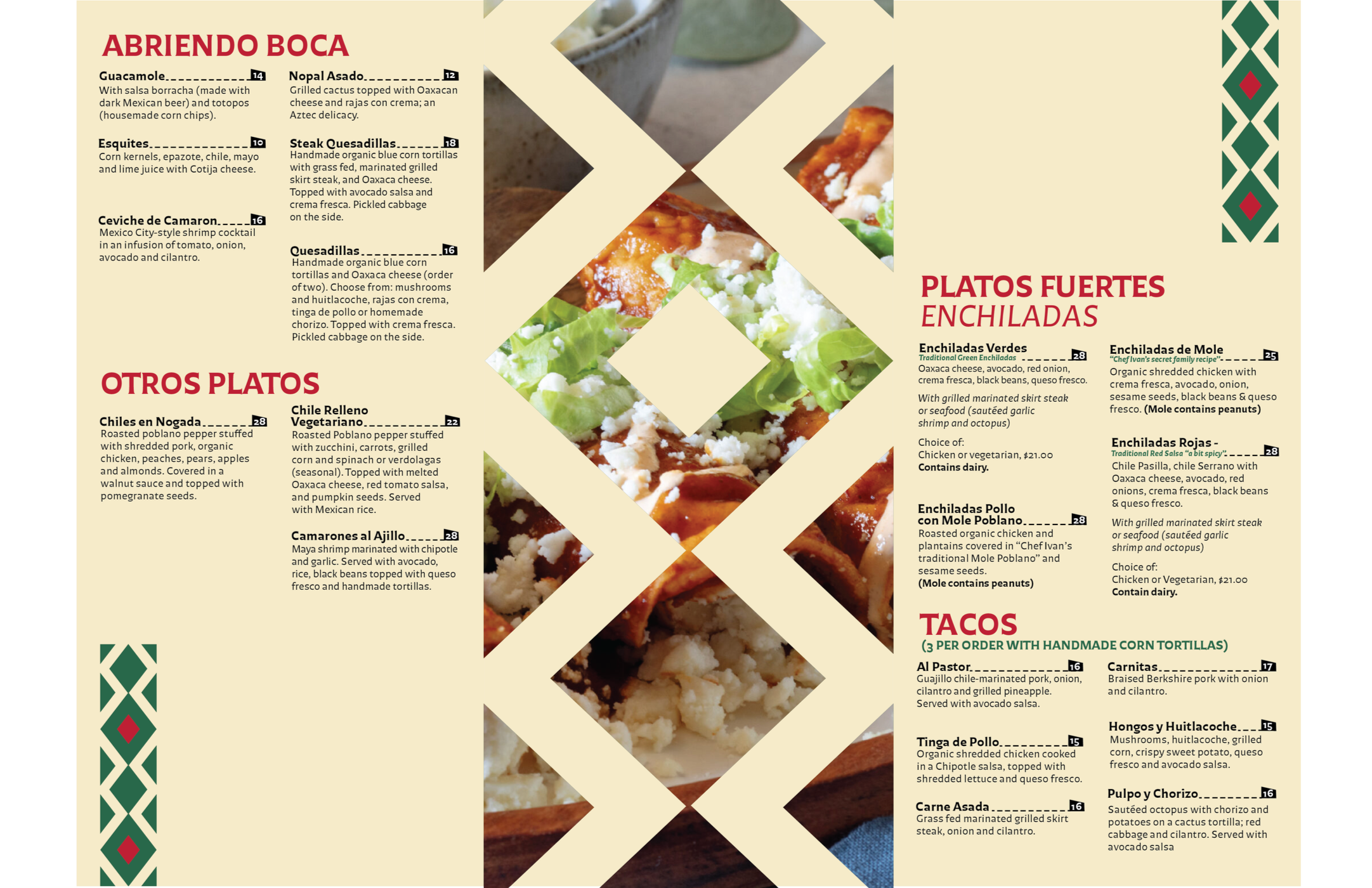
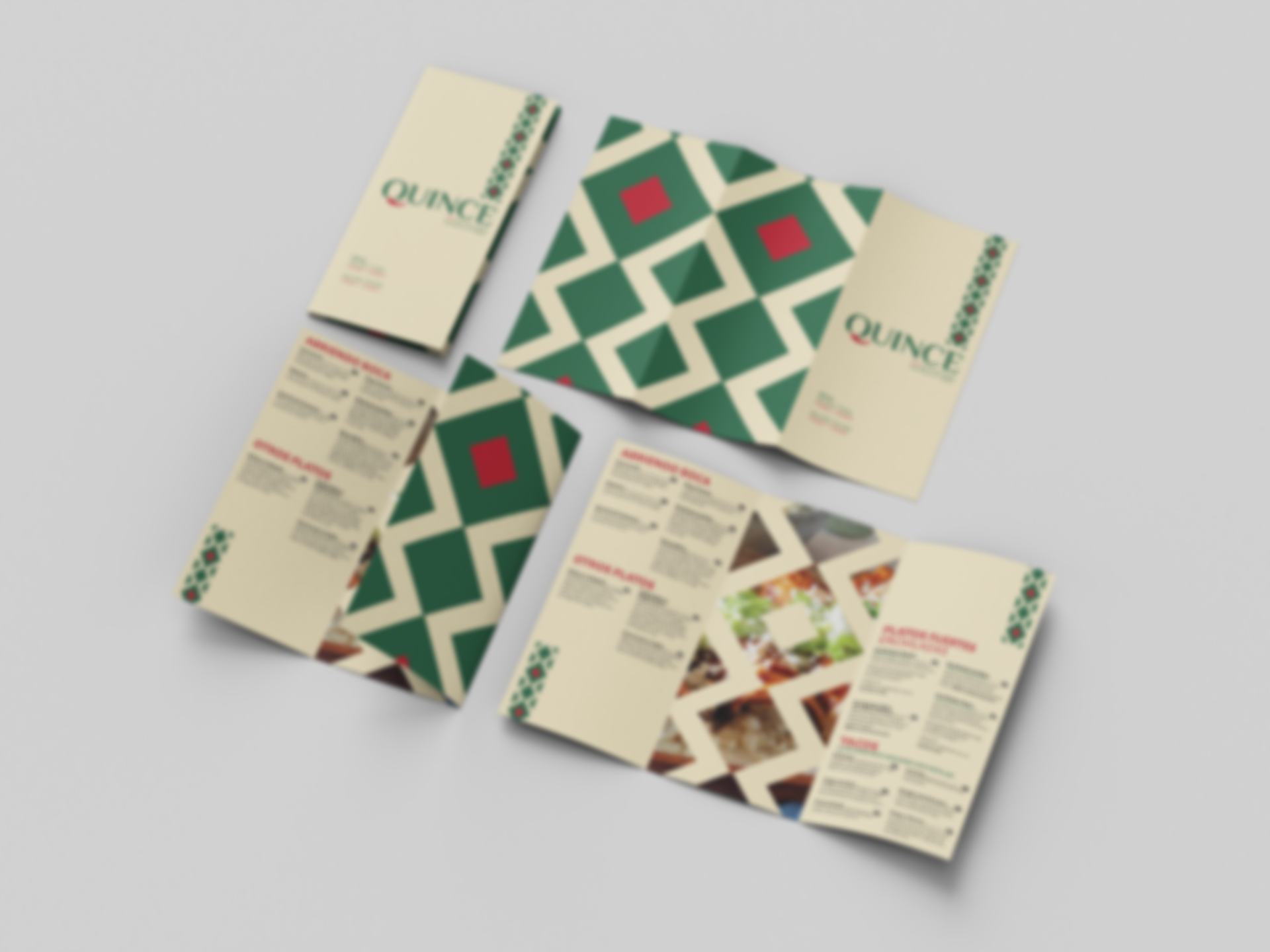
Through multiple iterations and rounds of feedbacks, I refined the brand identity into a system that communicates a modern and sophisticated aesthetic for a Mexican-Spanish fusion restaurant. In order to achieve consistency, I was careful with the consideration of typography, color palette, and form. I worked on developing a range of touch-points for the restaurant, including a magazine advertisement, business card, digital banner, and a restaurant menu.