Brand identity redesign for The Galápagos Islands
Research
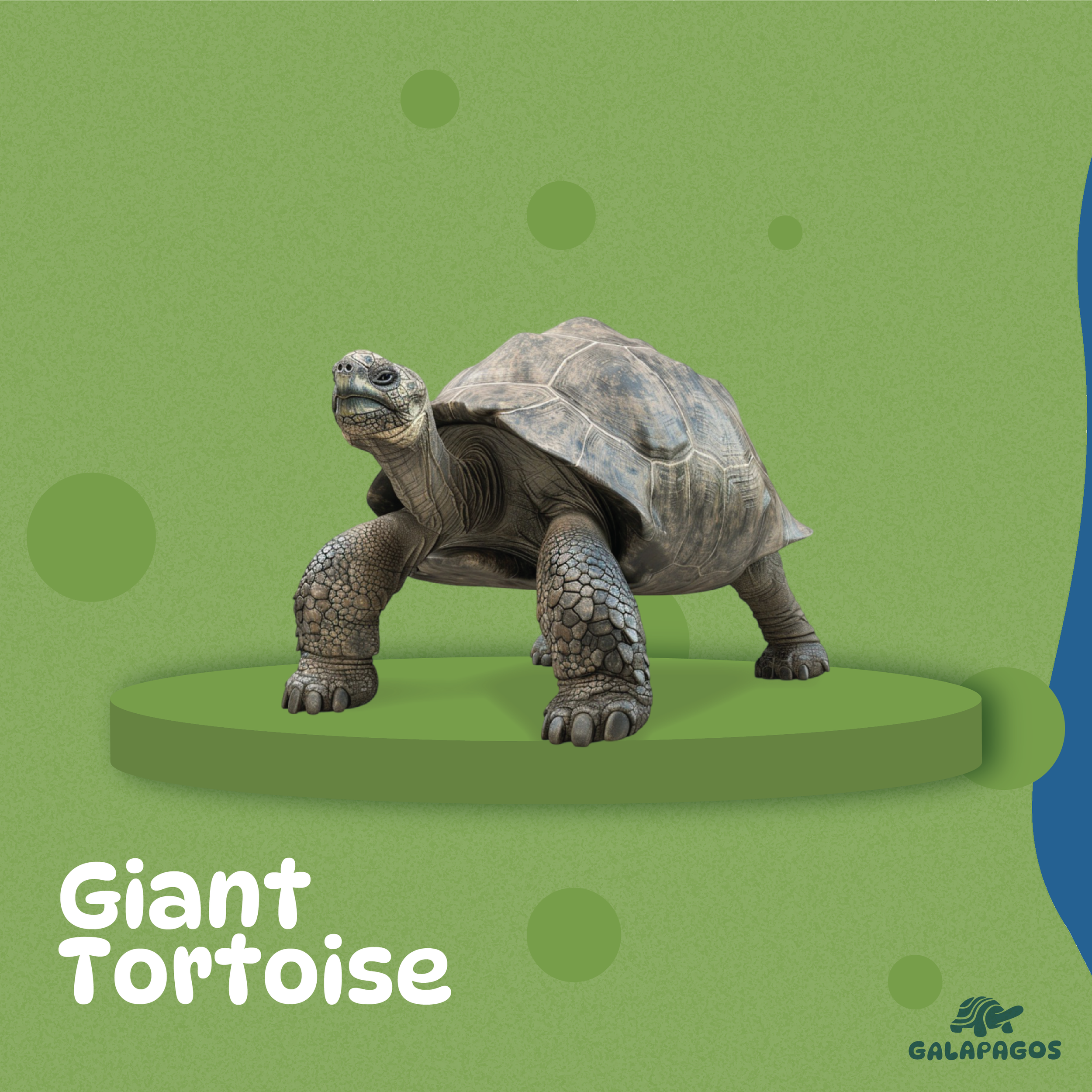
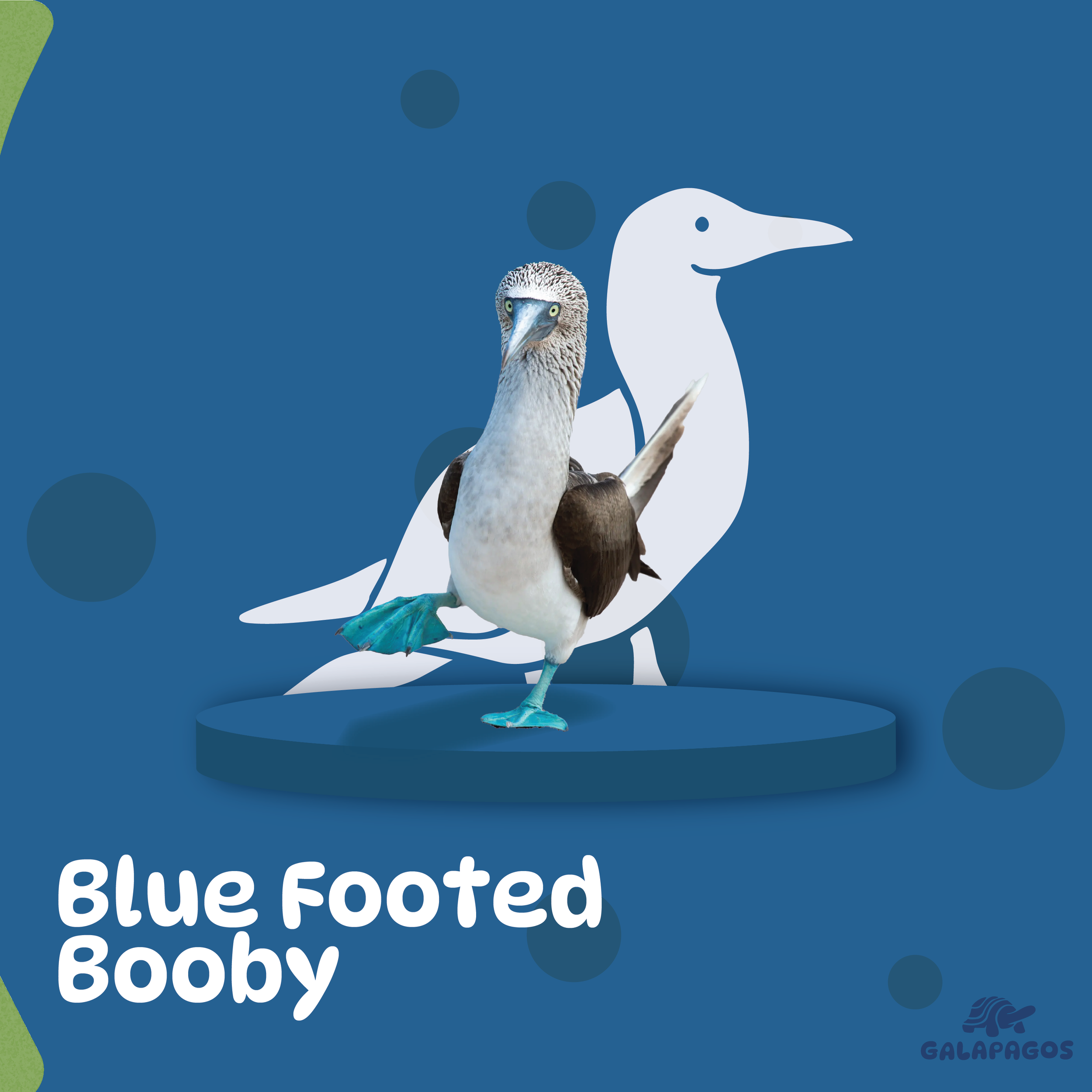
My research for the Galapagos branding began with a personal connection, diving into my Ecuadorian background and the islands’ recognition as a symbol of biodiversity. I began mood boarding the islands that highlighted key aspects of the Galapagos, focusing on its iconic tortoises, diverse marine life, and the distinctive volcanic landscapes. These references helped me identify key visual themes and motifs that guided the creation of a brand identity.
Brainstorm
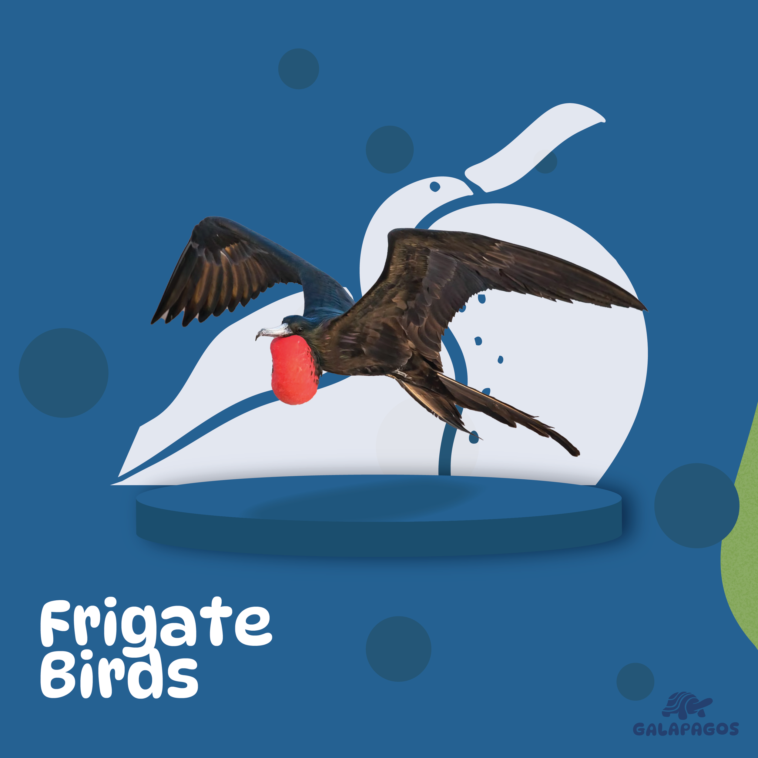
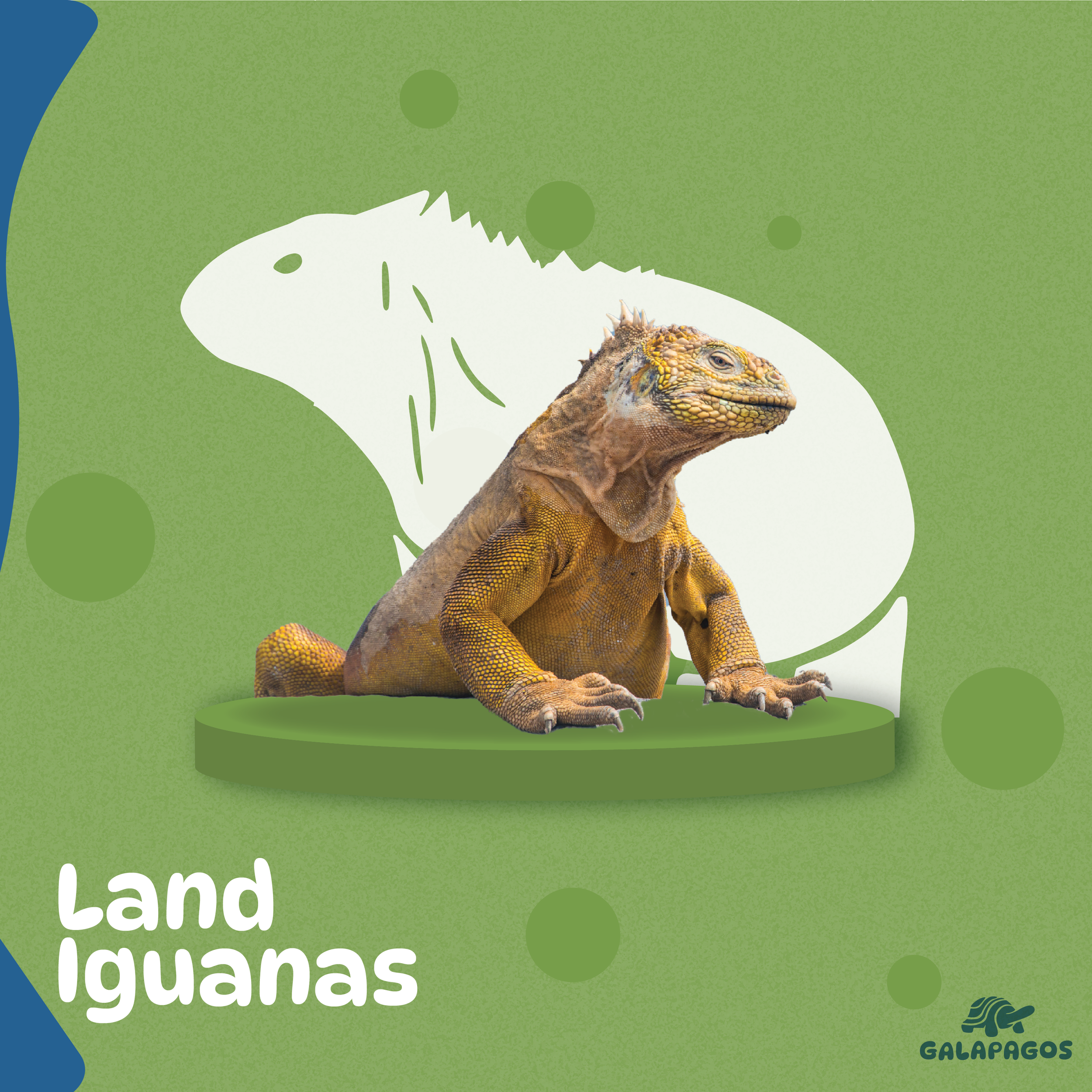
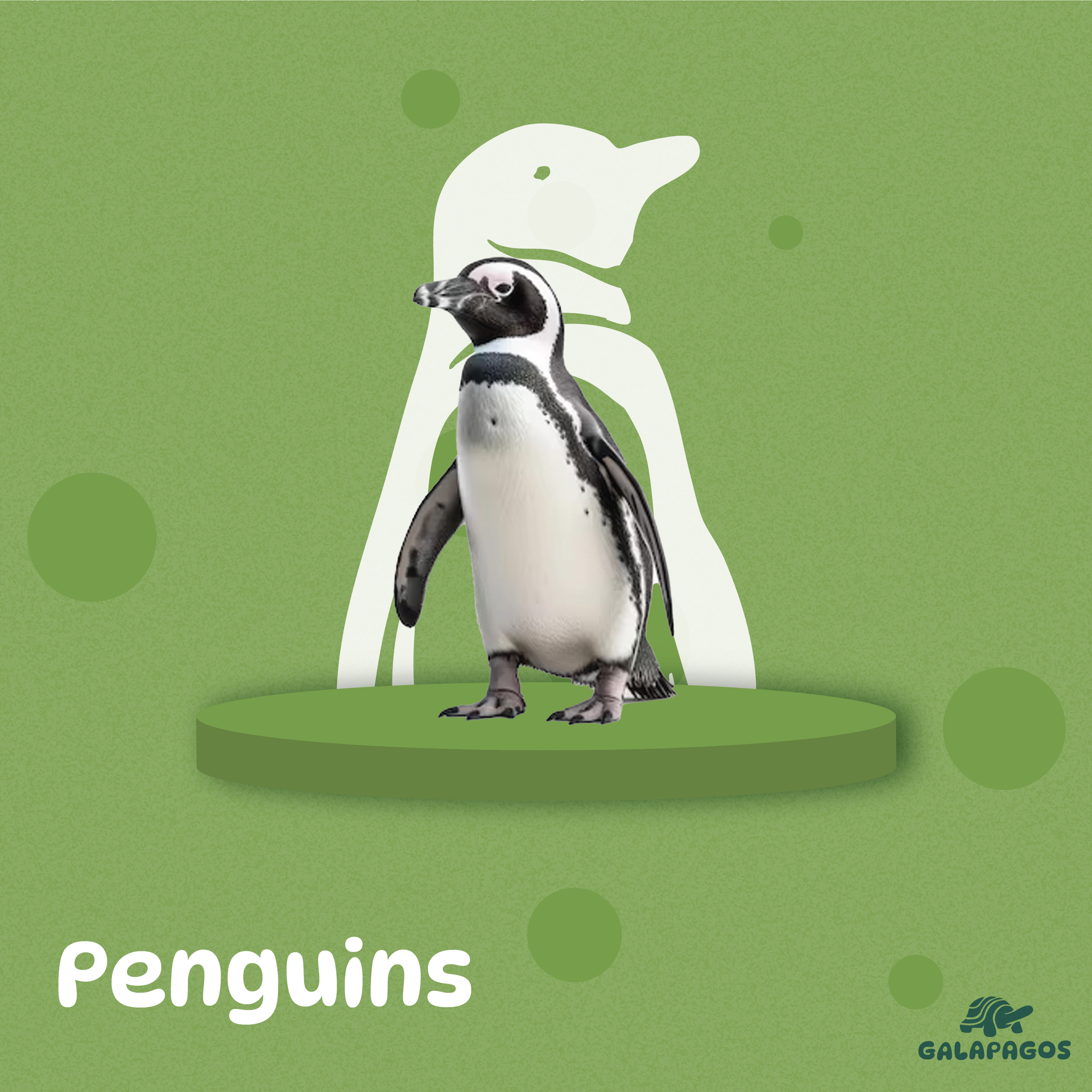
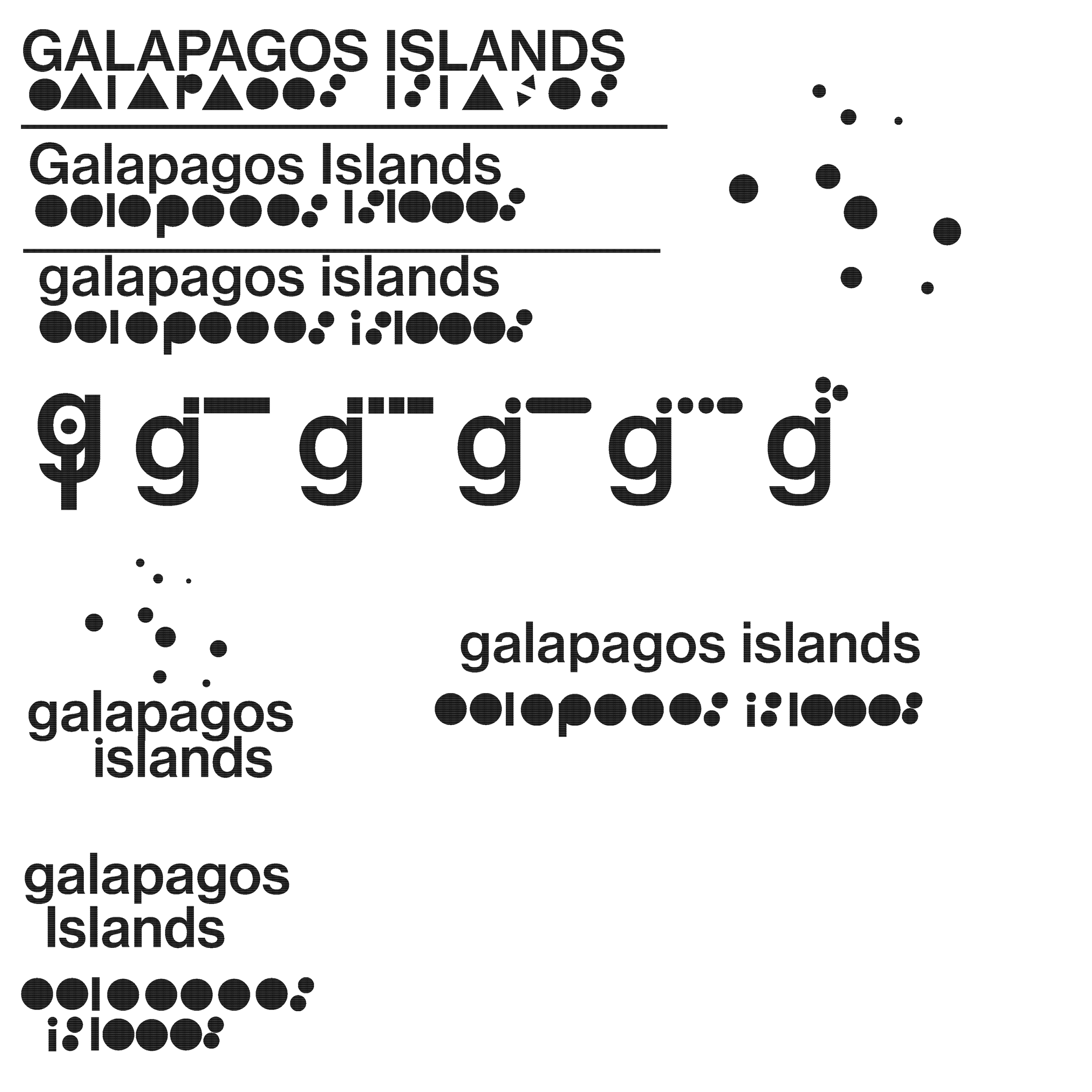
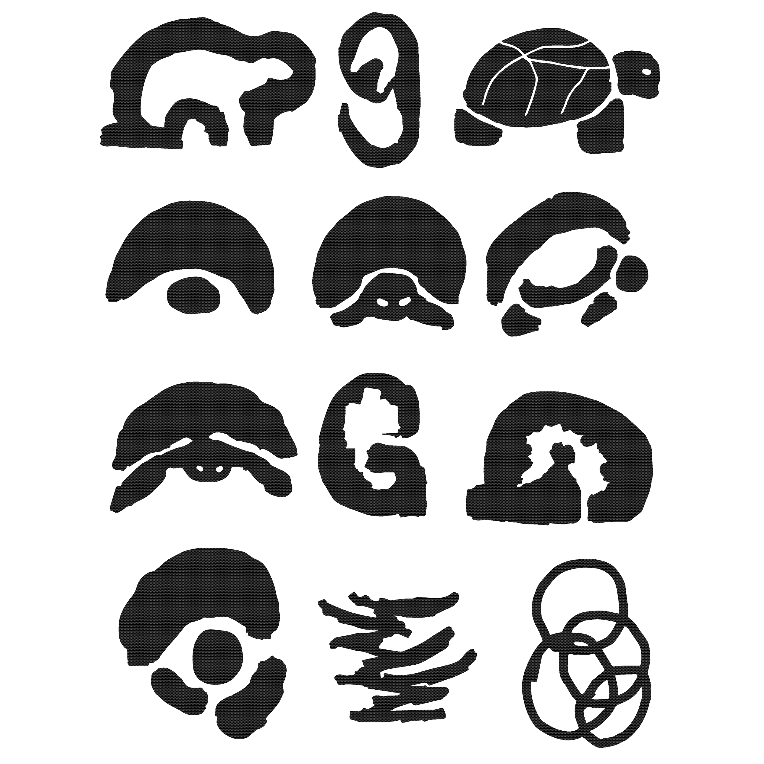
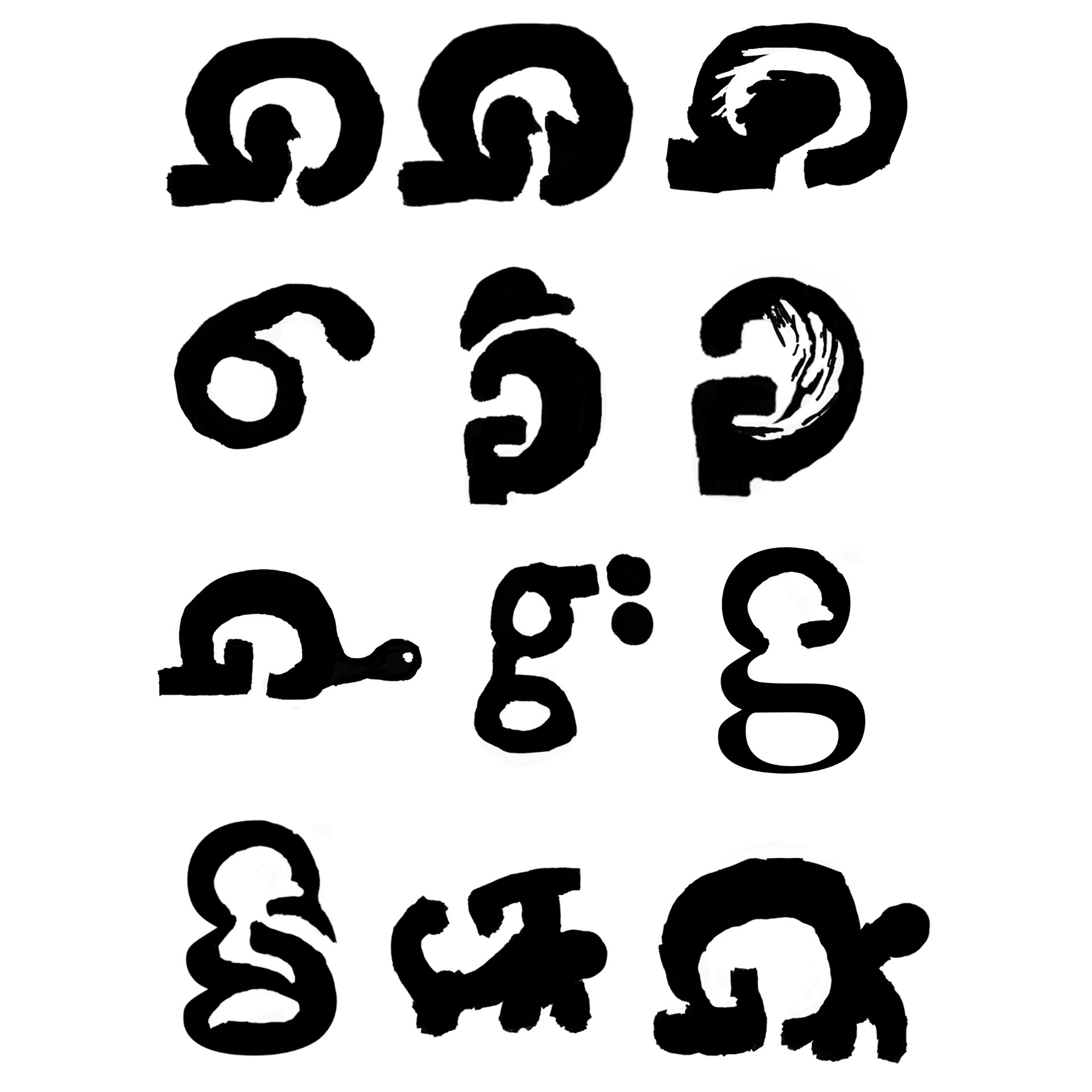
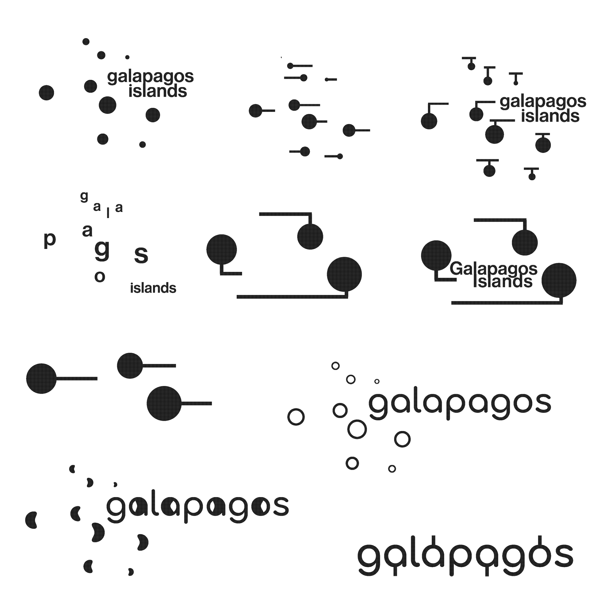
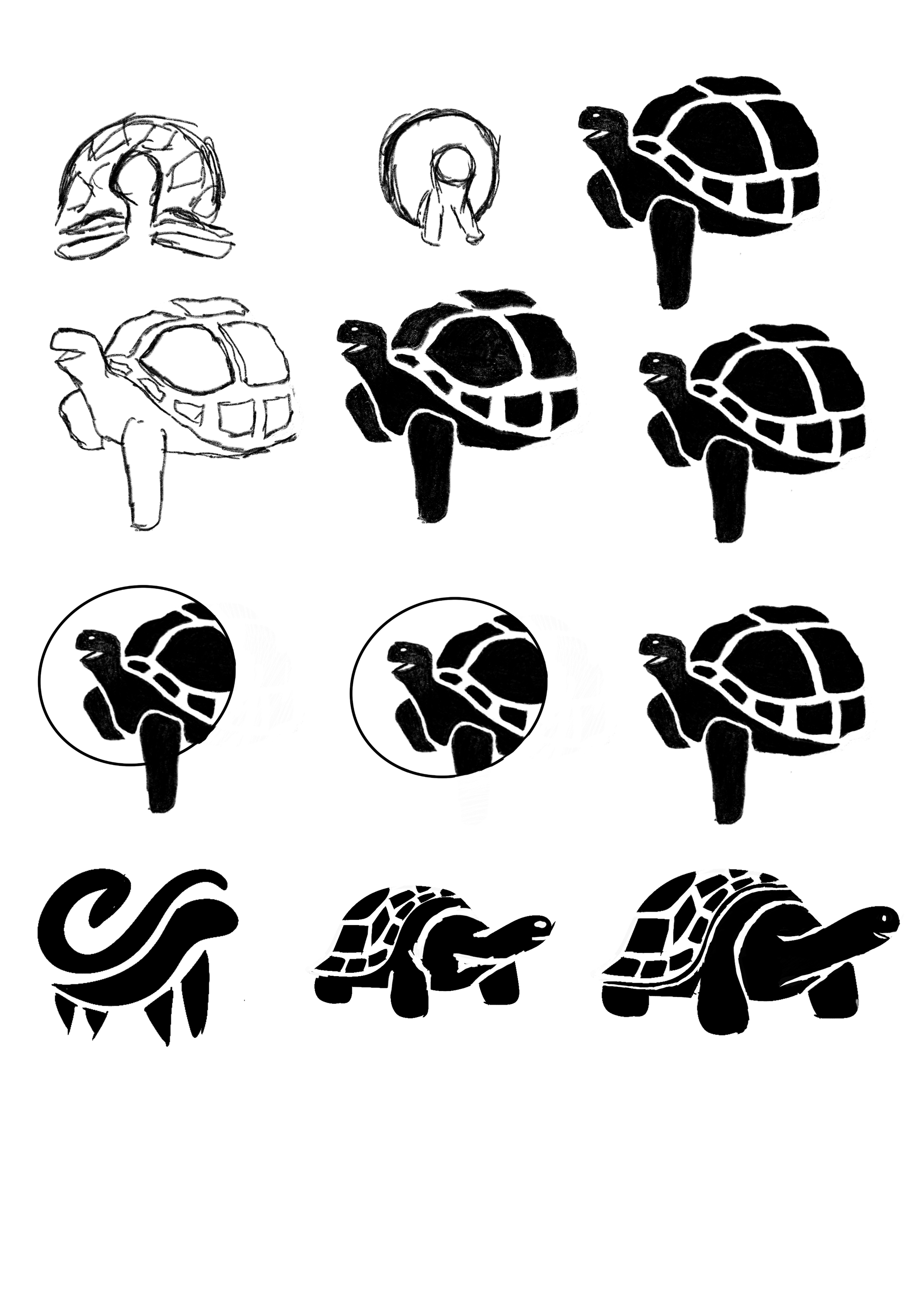
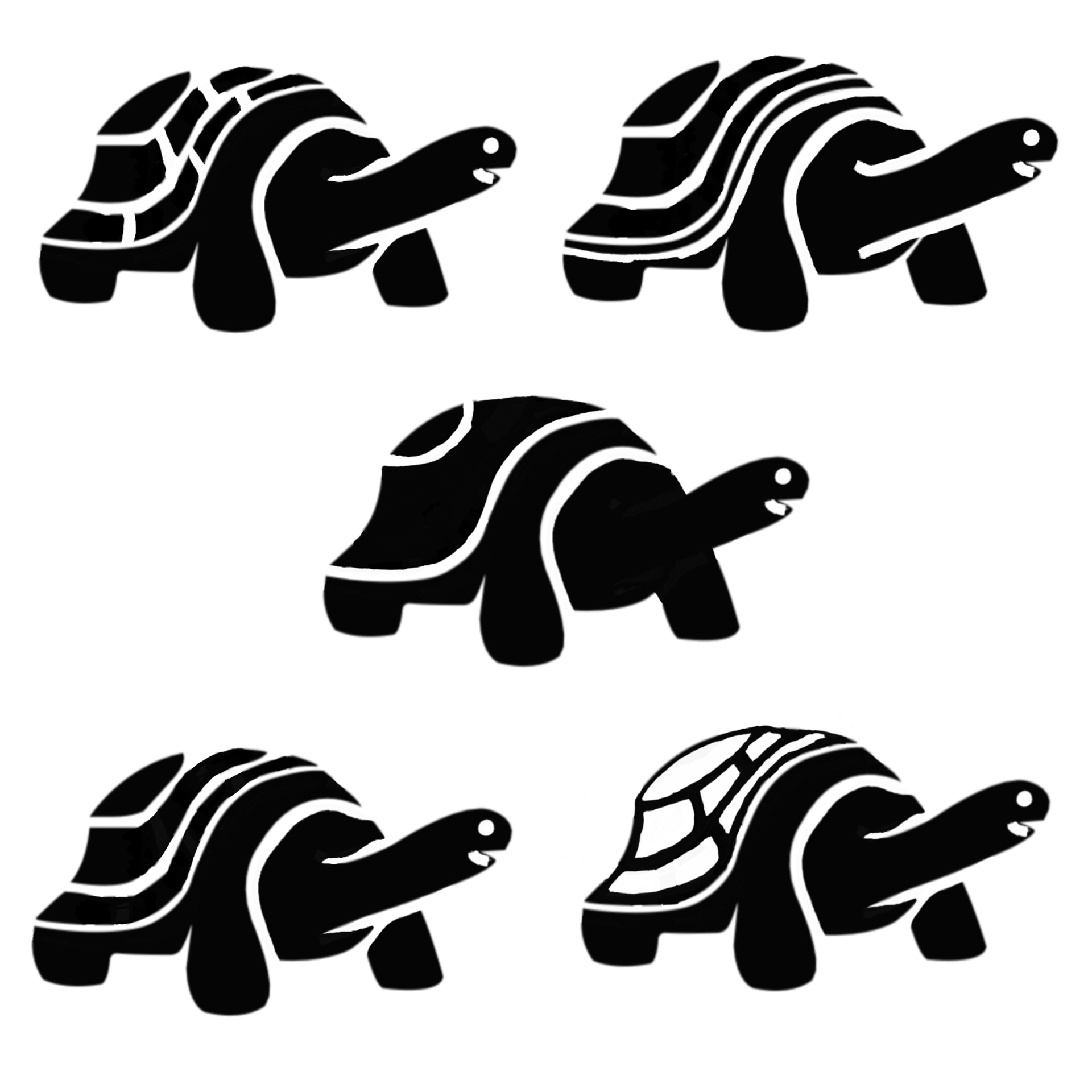
In the brainstorming stage, I created a variety of sketches to explore different visual representations for the brand identity. I focused on the iconic Galapagos tortoise, a widely recognized symbol of the islands. I also experimented with the typography itself, breaking down the shapes that form from each letter in the word “Galapagos”. I also explored incorporating dot patterns to represent the small islands that form the archipelago. These early studies began to lay the foundation for the design language of the brand.

Design & Refinement
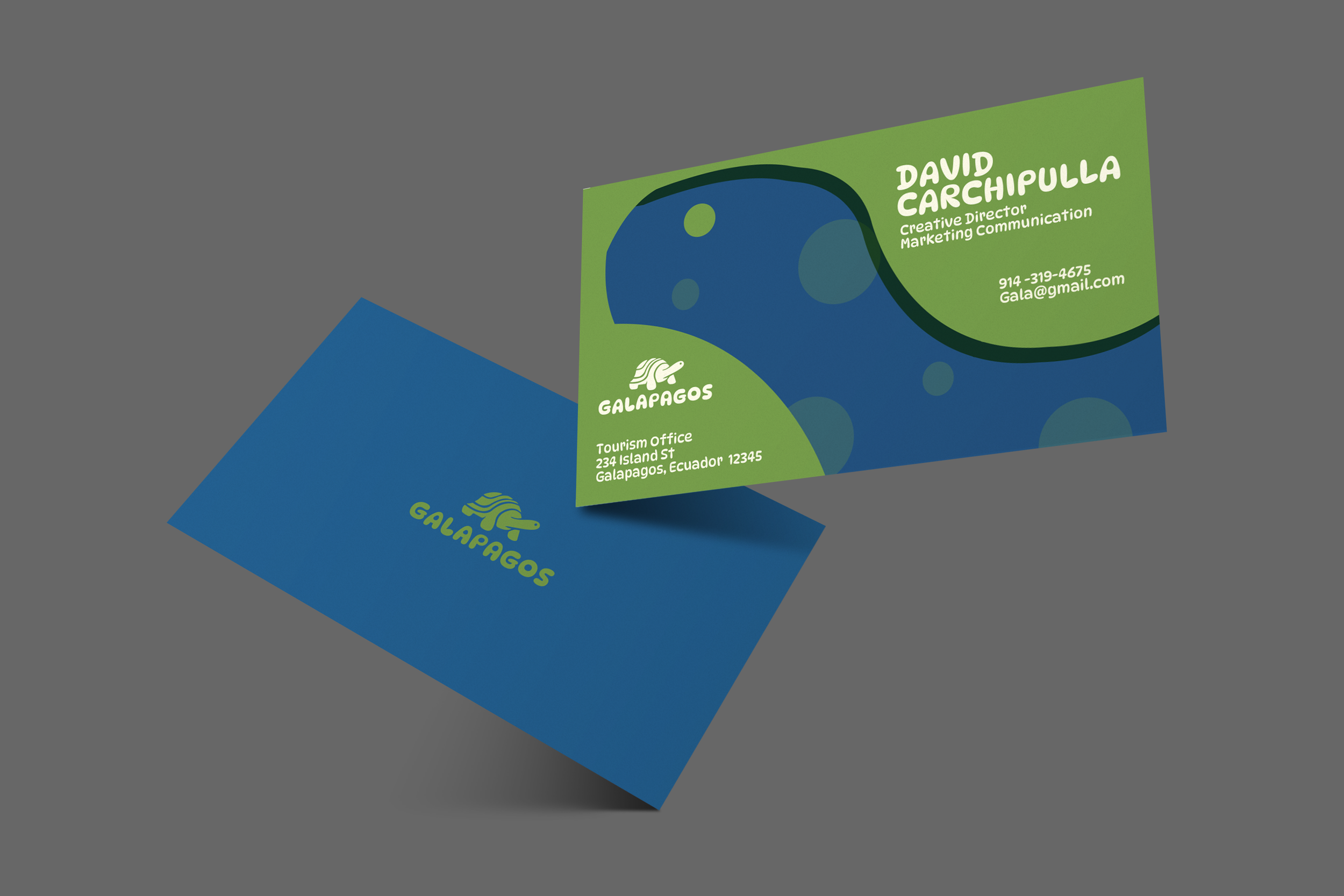
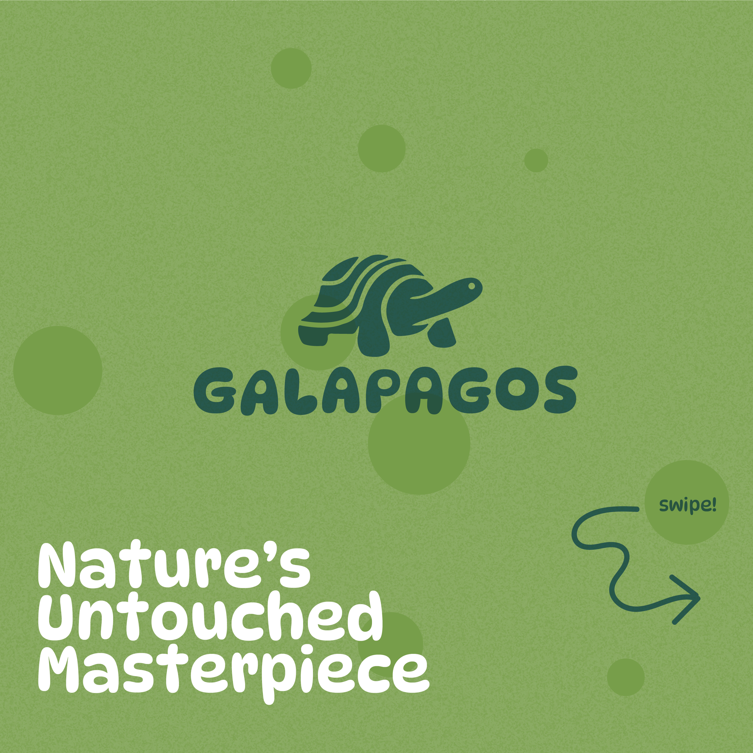
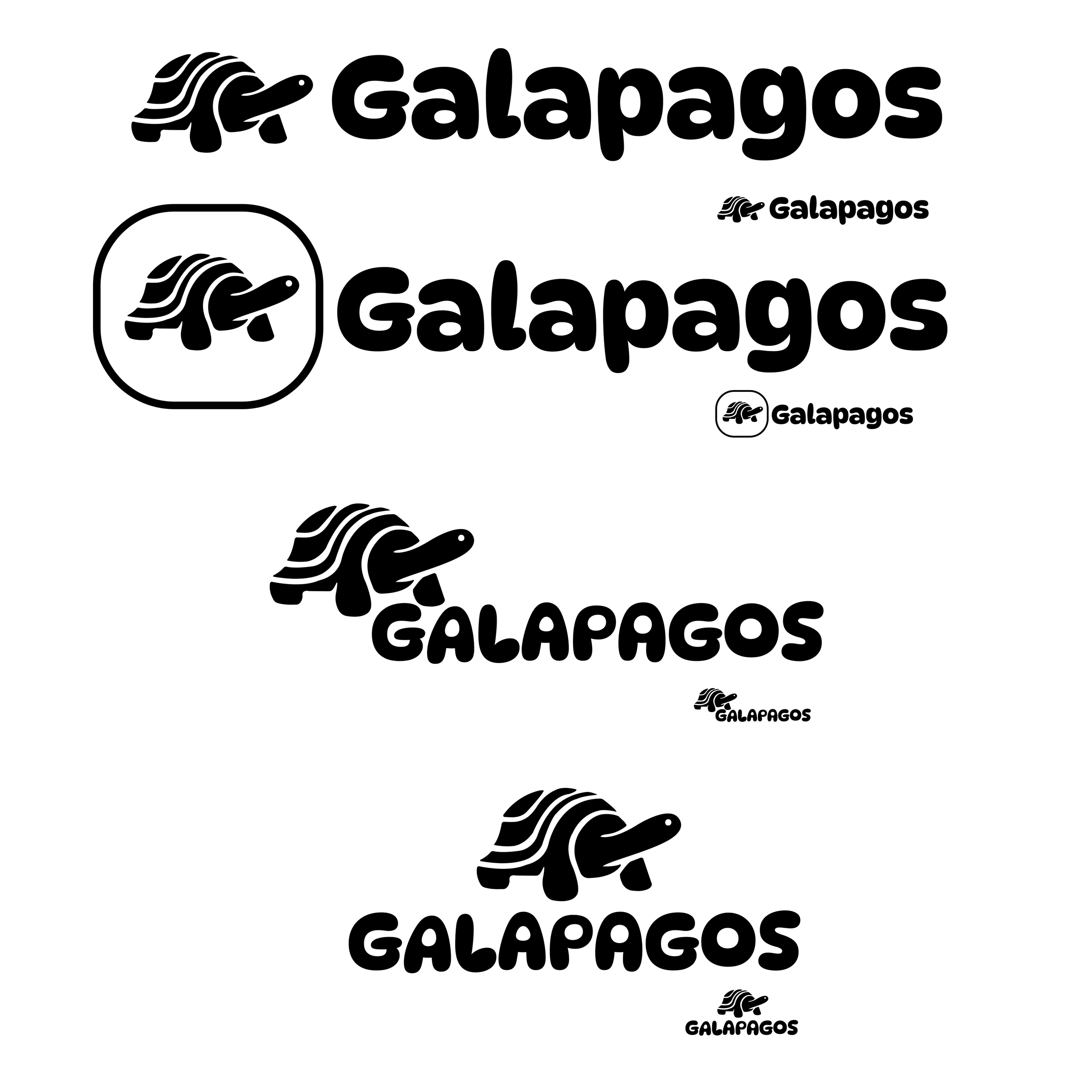
Through multiple iterations and rounds of feedbacks, the brand identity developed into a system that communicates a fun, family friendly personality. From the brainstorming stage, the presence of circular motifs and dots kept reoccurring , so I explored it and turned it into a flexible visual asset that carries throughout the brand, appearing in social media posts, business cards, website layouts, and merchandise. Their repetition creates a sense of movement that reflects the islands’ marine life. These dots also help unify the brand identity across various touch points.